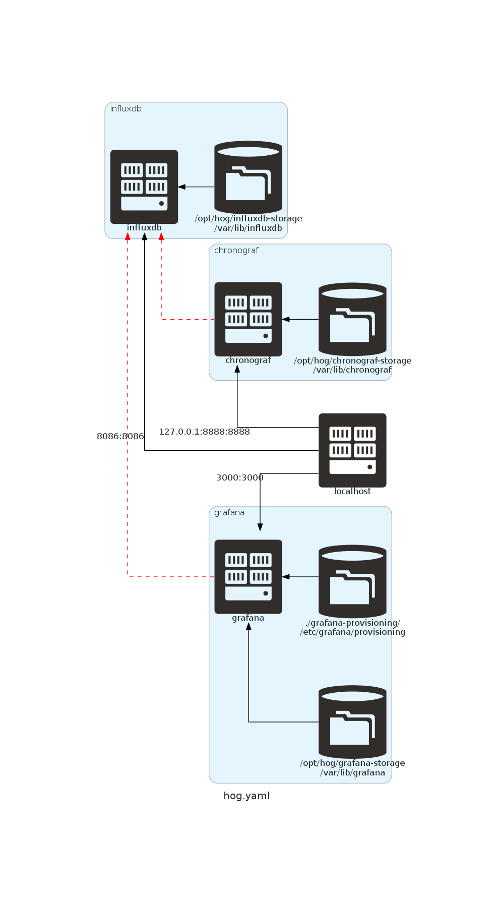
Continuing on my story line of documenting with code, I have found a neat way to visualize docker-compose files. The red dashed line indicates a dependency mapping. In this case, the grafana and chronograf services are depending on the influxdb service.